
Sokoliba
Implementation: Brand Guidelines
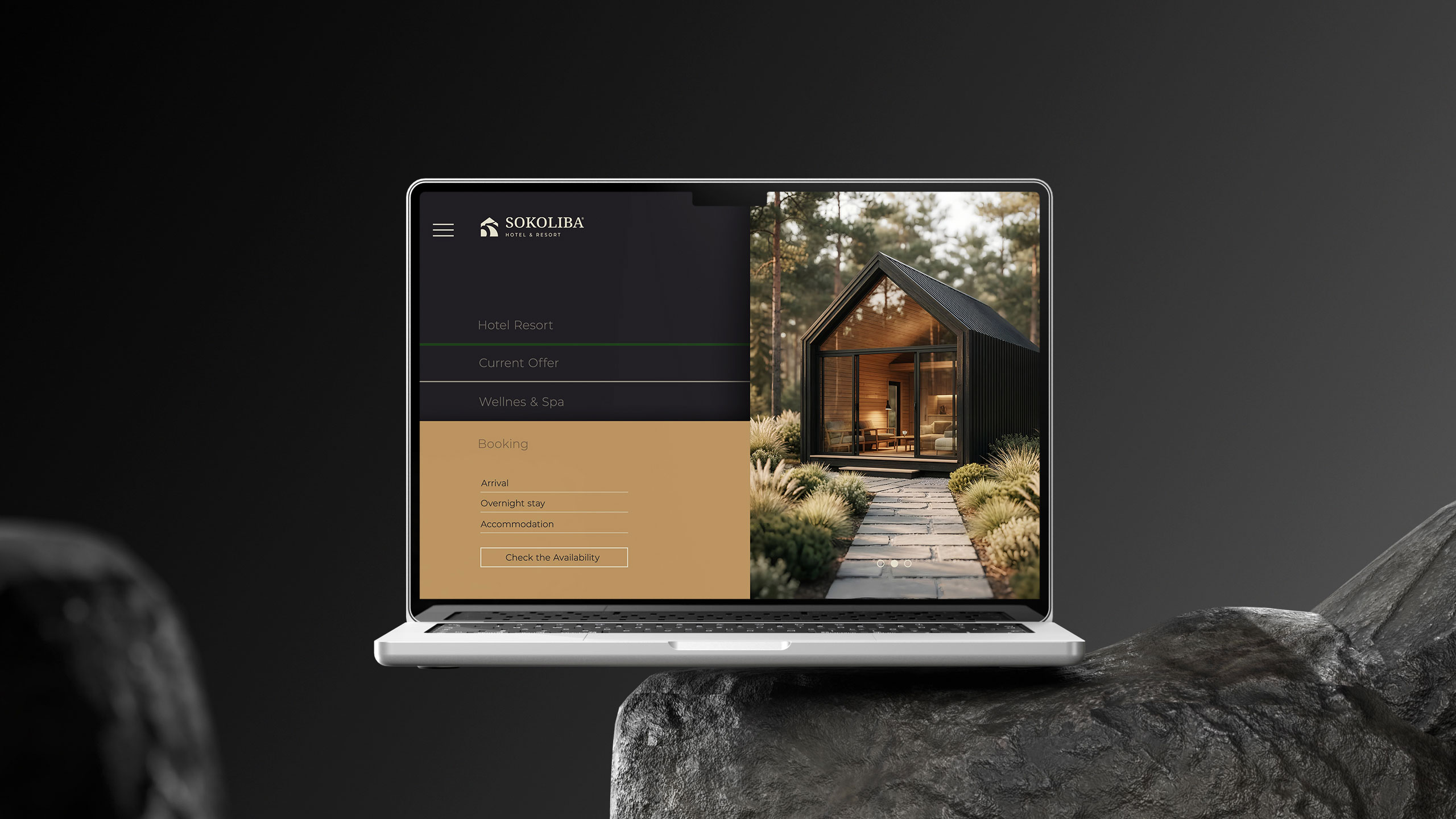
Project Context
The project required the creation of a visual identity for the SOKOLIBA® complex, which merges modern Swiss-standard architecture with the untouched natural landscape of the Sokobanja region. According to the client’s brief, the strategic task was to avoid generic tourism symbols and create a solution that exudes peace, discipline and long-term quality.
The visual identity had to reflect the precision of ecological construction and the unobtrusiveness of the structures within the landscape. A key requirement was the development of a mark that maintains recognizability through maximum simplification, ensuring functionality in print, digital environments and demanding technical applications such as engraving and embossing on natural materials.
Solution
A comprehensive approach to the visual identity design defines SOKOLIBA® Hotel & Resort through the prism of peace, quality and impeccable sustainability. The process began with the elimination of tourism clichés to create an identity that is aesthetically and functionally on par with Swiss construction standards and the ecological discipline of the complex itself.
At the heart of the logo is a monolithic symbol constructed as a dialogue between solid forms and empty space. The upper segment of the mark establishes a clear roofline for the structures, while the lower segment follows the topography of the mountain terrain. Between them, through the use of negative space, the silhouette of a falcon is integrated, giving the identity a local touch in a minimalist and modern way.
The SOKOLIBA wordmark is executed in an authoritative sans-serif font that mirrors the weight and strength of the symbol. While the brand name dominates with its stability, the “HOTEL & RESORT” sub-text serves as a foundation that horizontally balances the entire composition. Emphasized character spacing (kerning) reflects the vastness and freedom of the mountain environment, while the use of all-caps ensures modernity and high legibility.
The visual narrative is completed by a palette that is not just an aesthetic choice, but a chromatic echo of the Sokobanja landscape itself. Dominant forest green provides the identity with the depth and tranquility of untouched vegetation, while warm wood tones establish a direct link to the materials used in the buildings. This organic spectrum is complemented by accents of “natural dew,” bringing airiness and morning freshness, contrasted against monolithic tones of dark granite, which lend the brand the weight and permanence of stone. This selection ensures that the brand does not impose itself on the space but grows into it, becoming a natural extension of its surroundings.
Results
The final outcome is a visual identity that completely eliminates generic tourism aesthetics, replacing it with the peace and discipline of Swiss standards. By reducing the mark to its essential elements, maximum functionality was achieved, a key requirement of the brief.
The result is a stable identity that reflects the ecological precision of the construction, allowing the brand to become an unobtrusive yet powerful symbol within the Sokobanja landscape. A system has been created that provides SOKOLIBA® AG with a tool for long-term branding, establishing SOKOLIBA® Hotel & Resort as a benchmark of quality that remains independent of passing trends.


Priroda. Porodica.
Zajednička iskustva.
Prirodno
rizort naselje
Hotelski rizort
u prirodi


C35% M45% Y75% K0%
Pantone 7407C
RGB #af8c63
C13% M10% Y25% K0%
RGB #ddd9c1
C80% M45% Y100% K50%
Pantone 357C
RGB #254721
C25% M25% Y15% K92%
Pantone Black 6C
RGB #28242a