SkinCare Centar
Implementation: Prepress
www.skincarecentar.com
@skincarecentar_scc
Project Context
SkinCare Centar is a hub of top-tier expertise, with a team comprised of doctors and medical skincare specialists. The challenge was to create a visual identity that communicates medical credibility while maintaining aesthetic refinement. The goal was to develop a design that inspires confidence in the expertise of their treatments, ranging from classic skincare to complex aesthetic procedures. We aimed to achieve a flawless balance of science and aesthetics (beauty) that clearly articulates the center’s professional authority.
Solution
We focused on developing an identity that unites clinical expertise with sophisticated aesthetics, establishing a clean foundation for the brand’s ongoing communication.
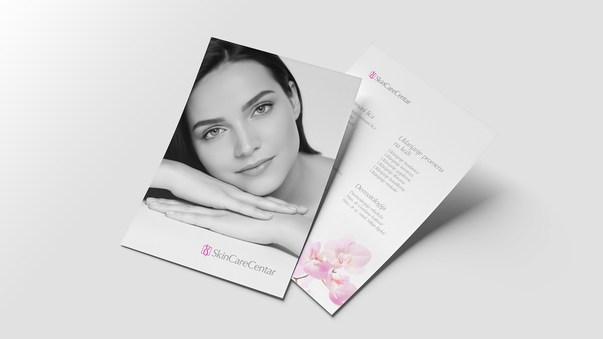
The logo consists of elegant typography and a mark featuring a subtle silhouette of a female form, communicating the very essence of the center’s services: the care of beauty and health. The precise geometry of the lines within the mark was projected to reflect medical accuracy, while the minimalist form of the silhouette retains a necessary softness.
The identity is dominated by a striking magenta combined with gray and white tones. While the gray communicates professional security, the magenta serves as a dynamic accent that gives the brand a recognizable character and a contemporary aesthetic standard.
When designing the key visual, we defined an art direction based on a stripped-back visual expression, using monochromatic photography of models that places the focus on skin texture, naturalness and a sense of trust. The minimalist composition and controlled use of brand elements allow for a clear information hierarchy, maintaining a medically credible impression while subtle visual accents soften the tone of communication.
The orchid was introduced as a supporting brand element. In the world of care, the orchid represents a symbol of timeless beauty and natural regeneration. It visually complements the story of a personalized approach and brings a note of organic refinement into the center’s medical context.
Results
SkinCare Centar has achieved an identity aligned with its position as one of the leading centers for skin health and care. A visual standard has been defined that reflects the expertise and dedication behind every service, laying the foundation for a consistent application of the identity within the physical space, across digital platforms and in all communication materials.