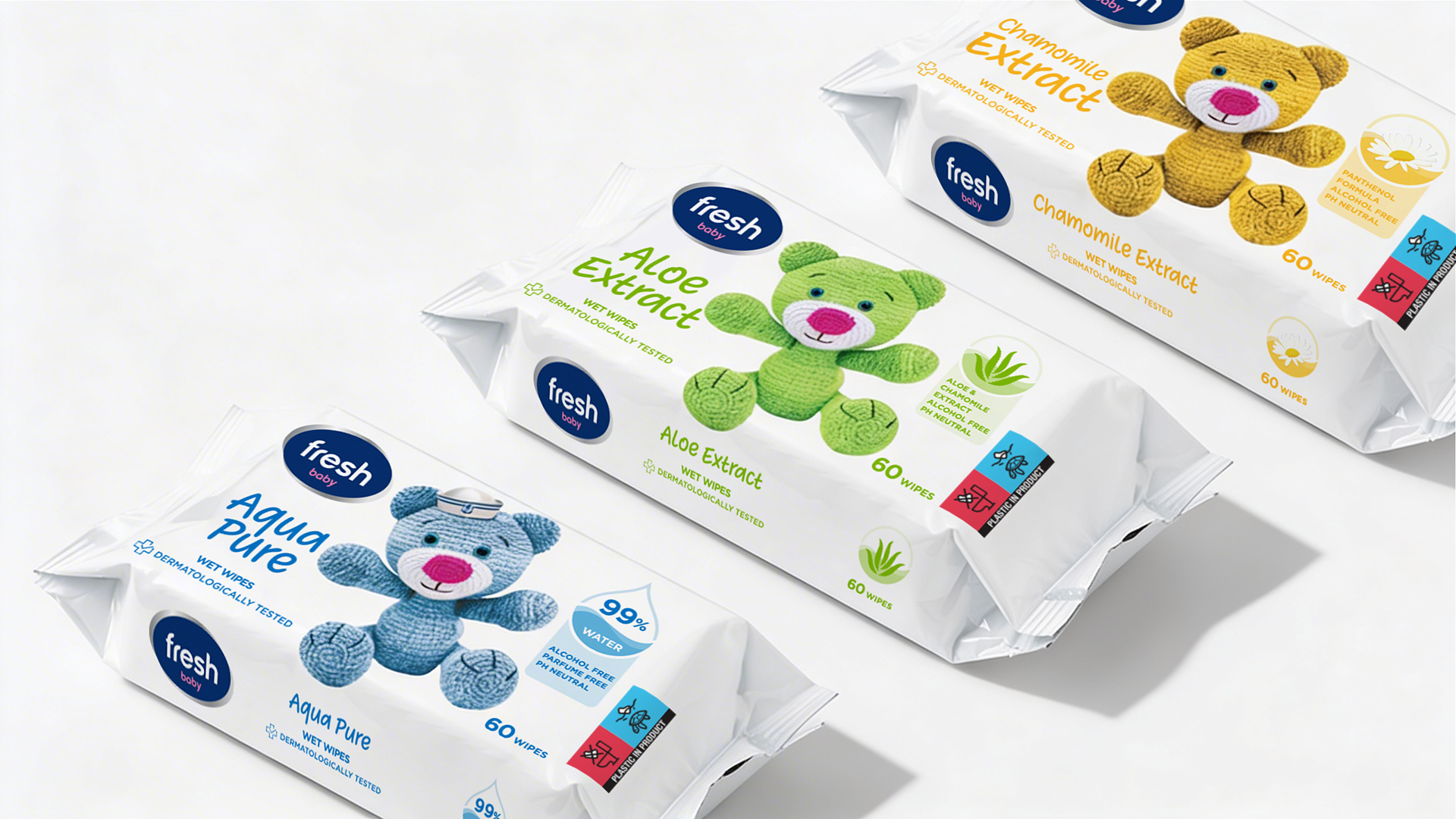
Building on the new brand architecture, we streamlined the visual communication to eliminate the cognitive load of the previous packaging design. Where loud typography and scattered information once competed for the customer’s attention, a clear visual hierarchy now dominates.
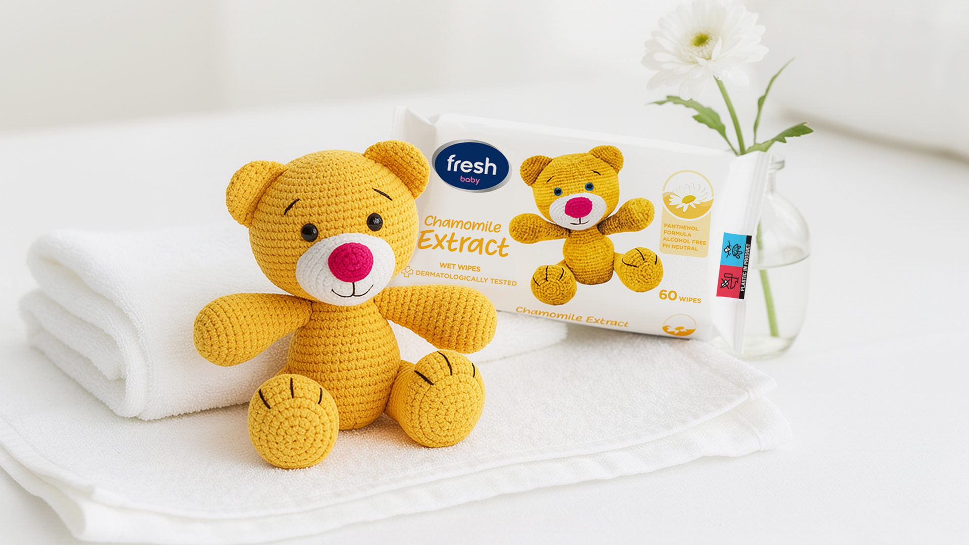
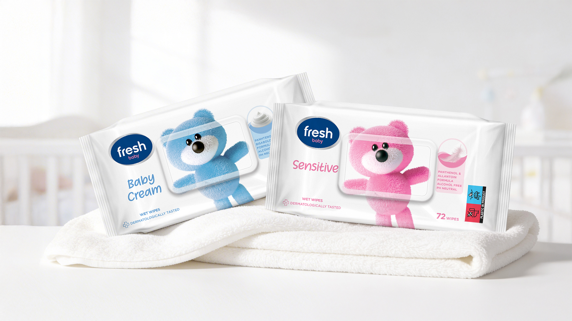
Primary: The redesigned Fresh Baby logo now consistently occupies the upper-left corner of the packaging.
Secondary: Product variants (Aloe Vera, Chamomile, Aqua Pure, etc.) are set in softer, modern typefaces, achieving the necessary gentleness in communication.
Tertiary: Key benefits, such as “99% water,” were distilled into clean, circular pictograms that provide quick quality assurance without visual clutter.
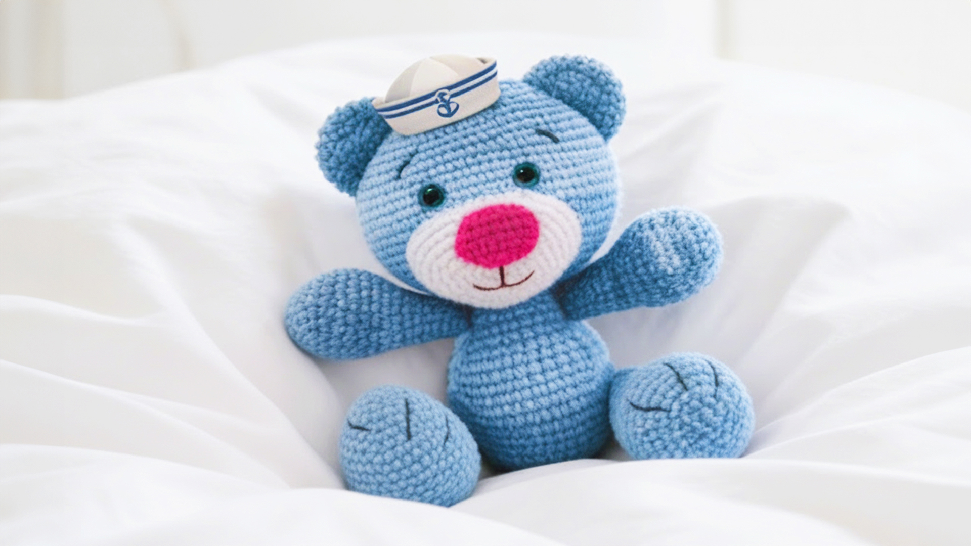
The recognizable Teddy Bear illustration was retained as the core of the identity and the central character. By scaling down the illustration and harmonizing its colors with the specific fragrance notes and ingredients, we achieved visual harmony across the entire product line.
The main shift in art direction was the transition to a minimalist approach and visual purification. We removed unnecessary shadows, gradients and heavy colors that previously “muddied” the design and created visual noise.
We introduced a concept of dominant white space that allows the packaging to “breathe,” subconsciously creating a sense of purity and reliability for parents. Simultaneously, this focus on white space contributes to a premium effect across the design.