

Notto
Identity & Design: Brand Naming, Tagline, Visual Identity, Logo Design, Packaging Design
Implementation: Brand Guidelines, Prepress
Project Context
For a long time, products from the food preparation, storage and serving segment were illogically integrated within the home hygiene and personal care brands in the Piramida company portfolio. This structure caused confusion among consumers, hindered clear positioning with retail partners and created uncertainty in assortment management within the company itself.
Solution
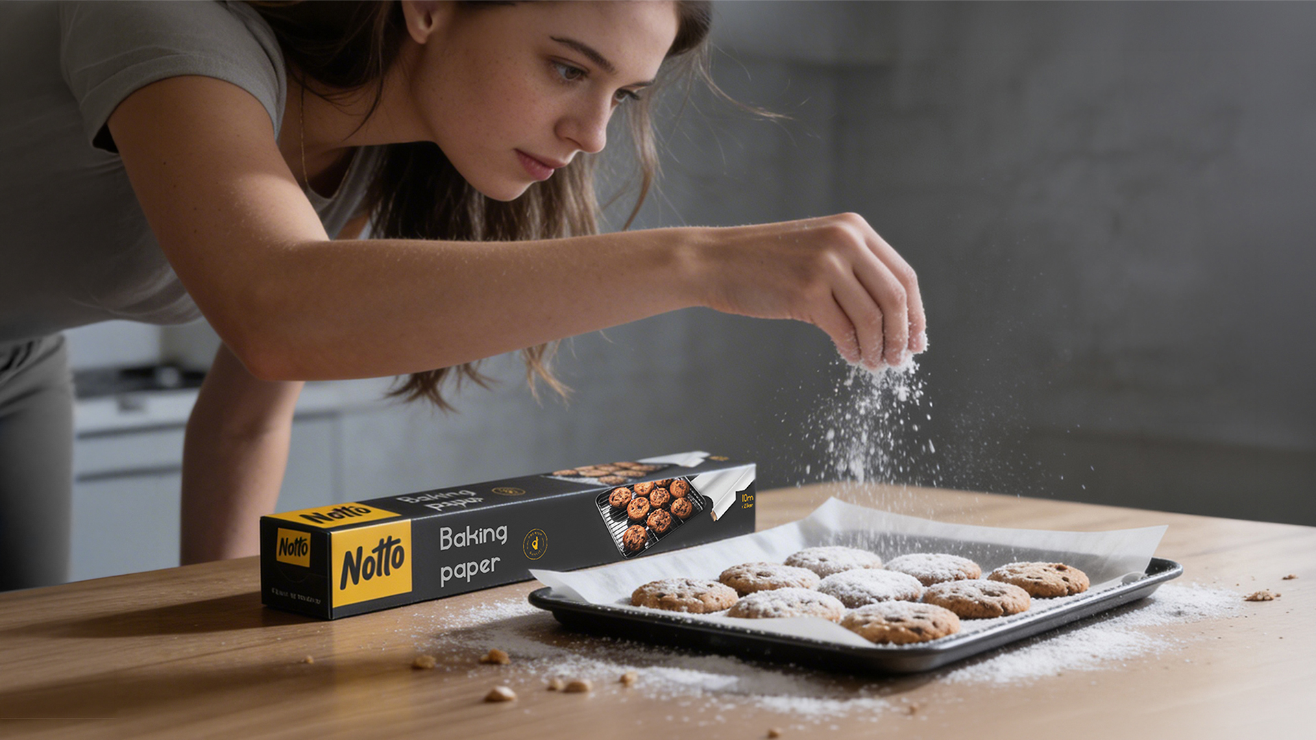
Through a strategic analysis of the portfolio and category structures, we clearly separated the food preparation, storage and serving segment, laying the foundation for its independent brand development. We created Notto-a new, standalone brand focused exclusively on these product categories.
The brand name was inspired by the English idiom “Not to be missed.” It evokes opportunities for gathering and socializing that shouldn’t be passed up, while indirectly suggesting that these products are an indispensable part of such moments.
The brand strategy is built on the values of practicality and creativity. Practicality is reflected through intuitive products that simplify everyday food preparation, while creativity inspires consumers to express themselves through serving. The brand’s mission is to use this combination to give consumers more time to share joy with family and friends. The verbal identity is finalized through the brand essence “The art of creating unforgettable moments” and the tagline “For all important occasions,” clearly linking the brand to the context of gatherings and shared experiences.
The brand design was created as a strategic response to the visual uniformity of the entire category. Instead of conforming to existing trends, a radical contrast was applied, ensuring the brand’s immediate visibility and a clear distinction from the competitive environment.
Results
A clear and functional brand architecture was established, reorganizing the previously fragmented portfolio and enabling consistent category management. Notto gained its own identity, while the home hygiene and personal care brands were relieved of an unsuitable assortment.
This transformation allowed the company to achieve more precise market positioning in the food preparation and serving segment, clearer communication with retail partners and a scalable foundation for further product development within the new brand.


C0% M0% Y0% K100%
Pantone Black C
R0 G0 B0
HEX #000000
C0% M23% Y100% K0%
Pantone 7548 C
R255 G198 B0
HEX #ffc600
C65% M62% Y64% K54%
Pantone Black 7C
R61 G57 B53
HEX #3d3935