NEW BRAND ARCHITECTURE
MASTER BRAND LOGO & SUB-BRAND LOGOS
MASTER BRAND LOGO & SUB-BRAND LOGOS
CLIENT'S ACTIVE LOGOTYPES BEFORE REDESIGN
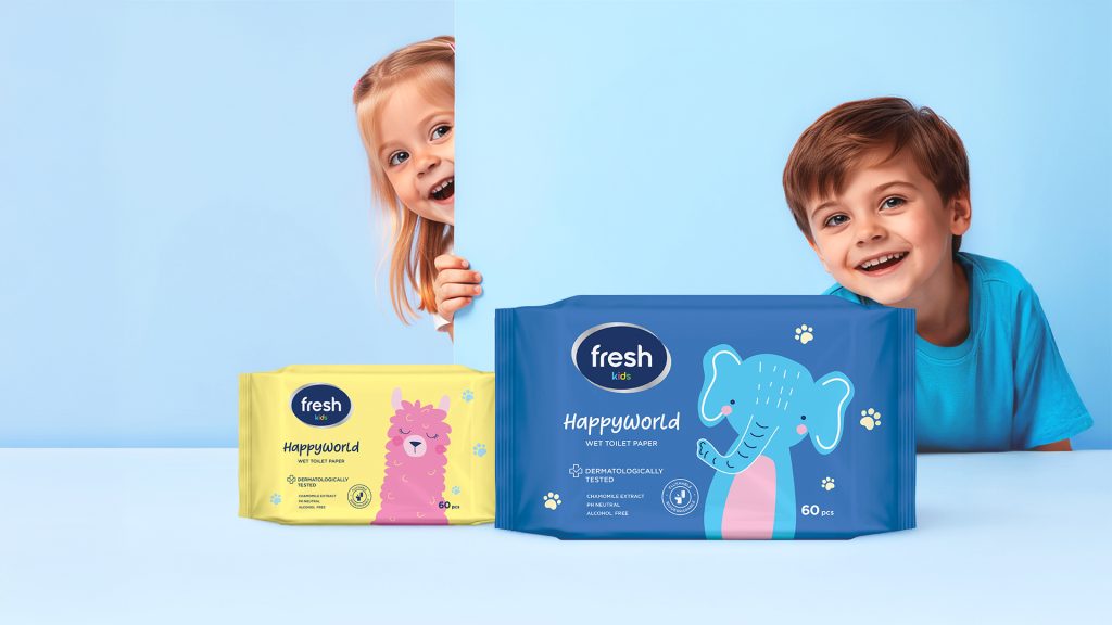
Fresh Kids | Wet and paper wipes | Serbia
Category Audit, Portfolio Consulting, Sub-brand Naming, Product Line Naming, Logo Redesign, Packaging Redesign, Packaging Design, Prepress
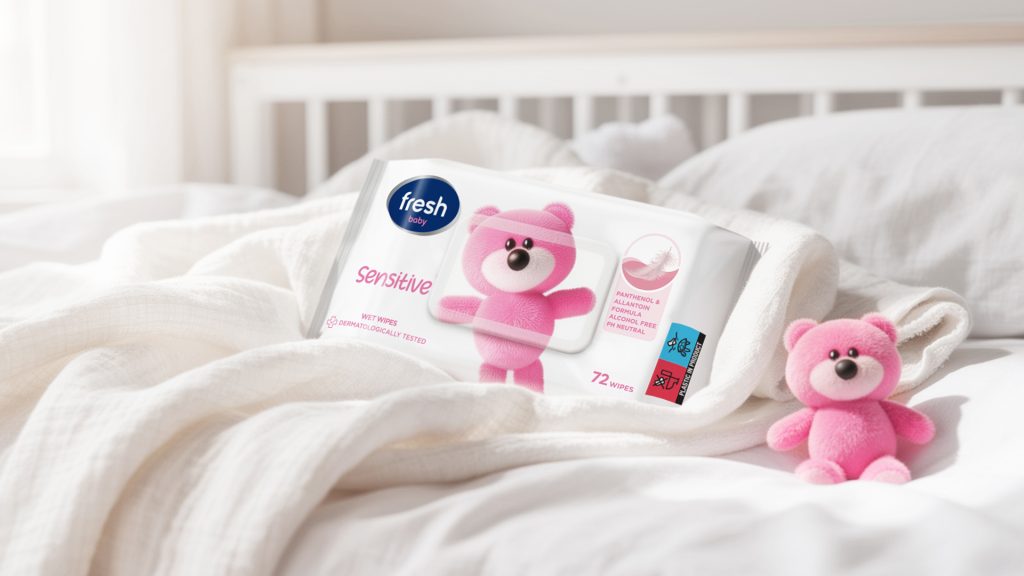
Fresh Baby | Wet Wipes | Serbia
Category Audit, Portfolio Consulting, Logo Redesign, Packaging Redesign, Prepress
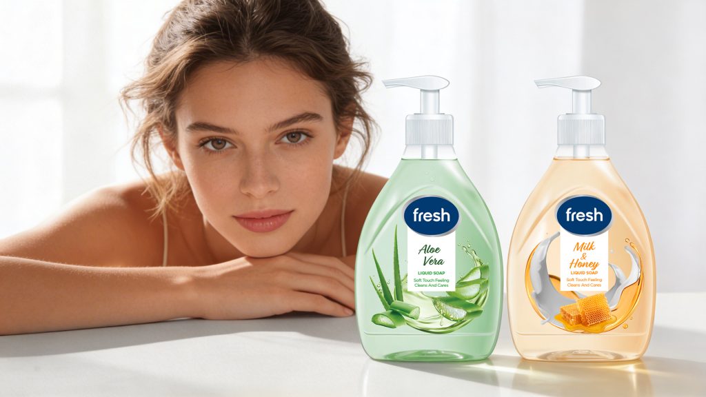
Fresh | Liquid soaps | Serbia
Category Audit, Portfolio Consulting, Logo Redesign, Packaging Redesign, Prepress
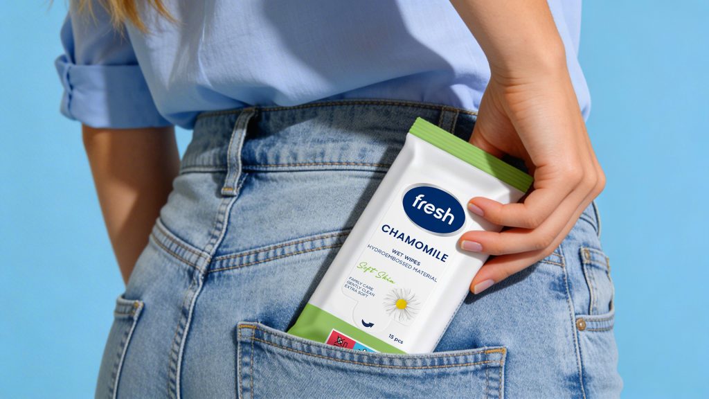
Fresh | Wet Wipes | Serbia
Category Audit, Portfolio Consulting, Logo Redesign, Packaging Redesign, Prepress
Fresh Baby | Wet Wipes | Serbia
Category Audit, Portfolio Consulting, Sub-brand naming, Logo Redesign, Packaging Redesign, Prepress